Create Compact Letter Display Layer Groups with at least one letter in common are not significantly different.
Source:R/geom_tukey.R
geom_tukey.RdCreate Compact Letter Display Layer Groups with at least one letter in common are not significantly different.
Usage
geom_tukey(
  test = c("tukey", "kruskalmc", "dunn"),
  type = c("two-way", "one-way"),
  threshold = 0.05,
  where = c("box", "whisker", "mean", "median", "se", "sd", "cl_normal", "cl_boot"),
  hjust = 0,
  vjust = -0.2,
  geom = "text",
  size = 4,
  color = "black",
  fill = "white",
  alpha = 1,
  na.rm = TRUE,
  reversed = FALSE
)
Arguments
- test
Which test to run for pairwise comparisons. Either
tukey(the default),kruskalmc, ordunn_test.- type
If a grouping variable is provided, determines whether to run separate tests for each facet (
one-way) or one (two-way) test with an interaction term betweenxandgroup. Defaults totwo-way.- threshold
Statistical threshold for significance. Defaults to 0.05.
- where
Where to put the letters. Either above the box (
box) or upper whisker (whisker) of a boxplot; at themeanormedianof the distribution; at the top of the error bars calculated from the standard error (se), standard deviationsd, or 95% confidence intervals returned byHmisc::smean.cl.normal()(cl_normal), orHmisc::smean.cl.boot()(cl_boot); or a fixed numeric y-position. A single number is recycled across all groups; a vector must have one value per group/facet, matching sorted group order.- hjust
Horizontal adjustment of the label. (Argument to
geom_text).- vjust
Vertical adjustment of the label. (Argument to
geom_text).- geom
Which geom to use to plot letters. Options are
textandlabel.- size
Label size. Argument to
geom_text.- color
Label color.
- fill
Label fill (only applies if
geom == "label").- alpha
Label transparency. Defaults to 1.
- na.rm
Logical. Whether to remove observations with NAs for the provided factors (i.e.
xandgroup) before plotting. Defaults toTRUE.- reversed
Logical. Argument to
multcompLetters3. Determines whether order of letters should be reversed. Defaults toFALSE.
Note
Thank you to Hiroaki Yutani
and Simon P. Couch for a couple of
very helpful blog posts (1,
2) describing the
ggplot_add syntax.
References
Piepho, Hans-Peter. An Algorithm for a Letter-Based Representation of All-Pairwise Comparisons. Journal of Computational and Graphical Statistics 13, no. 2 (June 1, 2004): 456–66. doi:10.1198/1061860043515 .
Piepho, Hans-Peter. “Letters in Mean Comparisons: What They Do and Don’t Mean.” Agronomy Journal 110, no. 2 (2018): 431–34. doi:10.2134/agronj2017.10.0580
Graves S, Piepho H, Dorai-Raj LSwhfS (2019). multcompView: Visualizations of Paired Comparisons. R package version 0.1-8. https://CRAN.R-project.org/package=multcompView
Examples
library(ggplot2)
set.seed(1)
data <- data.frame("Category" = c(rep("Low", 10), rep("Medium", 10), rep("High", 10)),
"Value" = c(rnorm(10, 5), rnorm(10, 5.5), rnorm(10, 10)),
"Size" = c("Big","Small"))
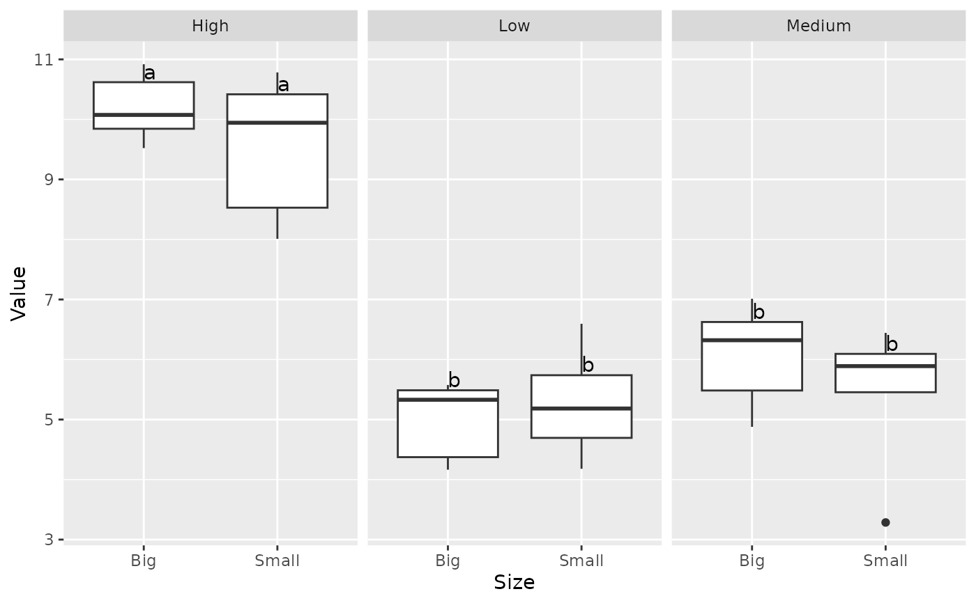
data |> ggplot(aes(x=Category, y=Value)) + geom_boxplot() + facet_wrap(~Size) + geom_tukey()
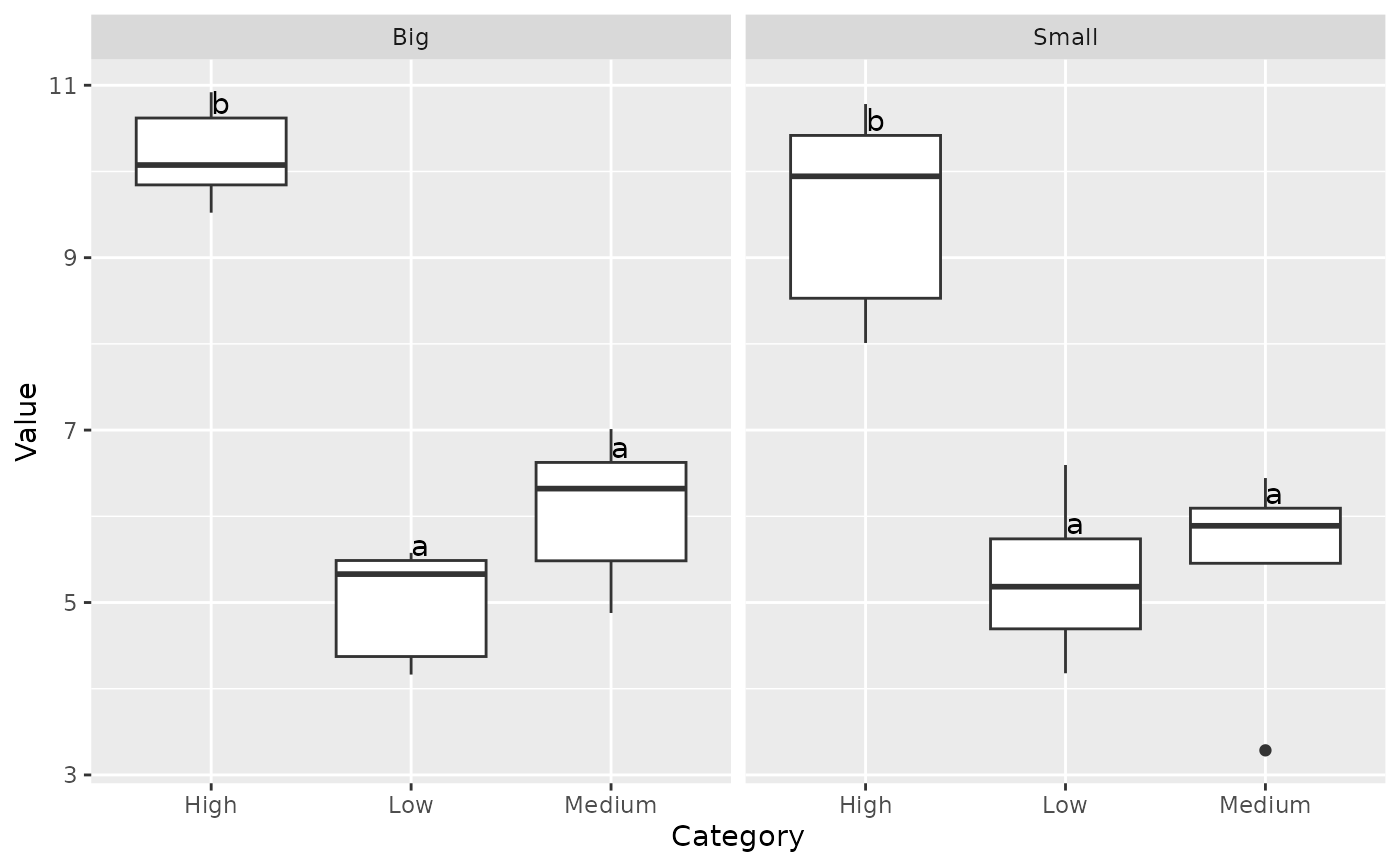 data |> ggplot(aes(x=Size, y=Value)) + geom_boxplot() + facet_wrap(~Category) + geom_tukey()